Reading Stock Charts Without Getting Confused
Tooba
Have you ever looked at a stock chart and felt like you were staring at an abstract painting? All those lines, numbers, and patterns can be overwhelming if you don’t know what they mean. But once you understand the basics, charts stop looking like a puzzle and start becoming a powerful tool to help you make better investment decisions.
What a Stock Chart Tells You?
A stock chart is like a time-lapse of a stock’s price. It doesn’t just show where the price is right now—it shows where it’s been, how it’s moved, and what investors might be feeling about it.
Think of it as a visual story. The price movements can reveal moments of excitement, panic, confidence, or hesitation in the market. Once you know how to read that story, you can spot patterns that often repeat themselves.
Understanding the Axes and Time Frames
Before going deeper, it helps to know the basics of how a chart is set up:
- The horizontal axis shows time. Depending on the chart, this could be minutes, days, months, or years.
- The vertical axis shows the stock’s price.
The time frame you choose can change what you see. For example:
- A one-day chart might show quick jumps caused by news or market sentiment.
- A one-year chart might reveal a slow, steady climb or a gradual decline.
Long-term investors often look at bigger time frames to spot overall trends. Short-term traders may zoom in on smaller time frames to find entry and exit points.
Line, Bar, And Candlestick Charts – What’s The Difference?
Not all charts are drawn the same way. The three most common styles are:
Line Charts
The simplest form. They connect the closing prices over time with a single line. This makes it easy to see the general direction of a stock but hides the daily ups and downs.
Bar Charts
Each bar shows the stock’s high, low, opening, and closing price for a certain period. This gives more detail than a line chart.
Candlestick Charts
Popular among traders, these use “candles” to show the same data as bar charts but in a more visual way. A green (or white) candle often means the price closed higher than it opened, while a red (or black) candle shows it closed lower. The length of the candle and its wicks can hint at market sentiment during that period.
Example: If a candle has a small body but long wicks, it might mean the price swung wildly but ended close to where it started, showing indecision among buyers and sellers.
Spotting Trends Without Guesswork
One of the first things people want to know is whether the stock is going up or down.
An uptrend is when the stock’s highs and lows keep moving higher over time. This often signals confidence from investors.
A downtrend is when highs and lows keep getting lower, suggesting selling pressure.
A sideways trend means the stock is moving within a certain range without breaking out up or down.
For example, if a company’s stock has been making higher highs and higher lows for months, it’s usually a sign that demand is strong. On the other hand, if the price keeps failing to break above a certain level, it might mean investors see that level as too expensive.
Support And Resistance – The Invisible Lines
Support and resistance are like invisible floors and ceilings in a stock’s price.
- Support is a price level where buyers tend to step in and prevent the price from falling further.
- Resistance is a price level where selling pressure often appears, stopping the price from rising.
If a stock keeps bouncing off $50, that’s likely its support. If it keeps struggling to get above $60, that’s resistance.
When a stock breaks through one of these levels, it can trigger strong moves. For example, if it finally pushes past resistance at $60, traders might rush in expecting more gains.
Volume – The Confirmation Tool
Volume shows how many shares are traded over a specific period. It's like a crowd meter.
A price move with high volume often carries more weight than one with low volume. If a stock breaks above its resistance level and volume surges, it’s usually a stronger signal that the move could continue.
Example: If a stock rises 5% in one day but on very low trading volume, it might just be a temporary spike rather than a true trend.
Moving Averages – Smoothing Out The Noise
Stock prices move up and down constantly, sometimes too erratically to read. Moving averages help smooth those fluctuations.
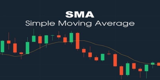
The Simple Moving Average (SMA) takes the average price over a certain period (like 50 or 200 days) and plots it as a line.
The Exponential Moving Average (EMA) gives more weight to recent prices, making it react faster to changes.
Many traders watch for “crossovers.” For example, if the 50-day moving average crosses above the 200-day moving average, it’s often seen as a bullish sign.
Chart Patterns – When History Repeats Itself
Over time, certain price patterns tend to appear repeatedly. These can sometimes hint at what might come next.
- Head and Shoulders – Often signals a potential reversal from an uptrend to a downtrend.
- Double Bottom – Suggests the stock tried to fall twice but couldn’t break support, hinting at a possible move upward.
- Triangles – Price squeezes into a smaller and smaller range before breaking out in one direction.
Example: If a stock has been forming an ascending triangle (higher lows, same resistance level), traders might expect a breakout above resistance.
Avoiding Common Mistakes
Even with all this knowledge, it’s easy to get carried away. Here are a few traps to avoid:
- Reading too much into tiny movements. Not every small dip or spike is meaningful.
- Ignoring the bigger picture. A strong short-term move can still be part of a long-term downtrend.
- Forgetting external factors. Earnings reports, economic news, or major events can quickly change the meaning of a chart.
Practicing Without Risk
If you’re new to chart reading, it helps to practice without risking money. Many financial websites and apps let you view live charts and even “paper trade” with virtual funds. This way, you can test your understanding of trends, support, resistance, and patterns before committing real cash.
Turning Confusion Into Clarity
Reading stock charts isn’t about perfect predictions—it’s about boosting your chances by seeing the story behind price moves. Recognize trends, key levels, and confirm with volume and patterns, and you’ll know when to act or wait. With practice, those confusing lines will make sense, and following the market’s daily rhythm might become something you look forward to.